Notice

Notice: The links of products and designs for sale on this site contain cookies in the form of a referral code. The purpose of this is simply to allow me to receive credit for any purchase you may make as a result of having visited my blog first. This does NOT provide me with any information about you or impact the price you pay for any merchandise, but it will increase my commission. If you object to this, simply do not click on any such links. (Links to contest entries and art not stated to be for sale do not contain cookies.) Thank you for your support and understanding.

Thursday, May 29, 2014

For the Love of Music

Music is very much a temporal art. How many pictures can you glance at in any moment? How fast can you read? Some DVD players let you watch a movie at increased speed without losing the sound. And while it's true that you'll enjoy these things more at a leisurely pace, listening to music is one pastime that can't be rushed.

I have a strong background in music and love nearly every type. From classical, rock, pop, and New Age to folk musics from around the world, it's all good. I hate driving without some tunes and listen at my computer as long as I have the RAM to support it. Even when it's quiet around me, there's usually a tune inside my head. And with all the wonderfully talented and creative musicians in the world spreading their art faster and further than ever before, there's just no way anyone can take it all in.

That's the inspiration I felt when I made this design, "So Much Music, So Little Time."


I wanted it to be fairly simple and show how music enriches our minds and fills our world with "color for the ears." While I adore bright colors, sometimes they have the greatest impact when contrasted with neutrals. In this design, the music is what it's all about, and that's where the color is.

Threadless.com is currently running a themed competition called "Make Your Statement," and this particular statement of mine has been accepted for scoring now through the morning of June 5, 2014. If you have an account with Threadless, please click over there and put in your two cents worth.


Thanks for visiting and please come again!


Saturday, May 17, 2014

"Butterfly Ripples"


Butterfly Ripples digital art orange pink rings

The weather has been very warm this week—even a few days of break-out-the-shorts-and-tank-tops warm—and after the winter we endured, it's more than welcome. It also means more springtime inspired art!

Butterflies are another thing I love about warm weather. Who doesn't love them?  They're second only to bees in the service of pollination and their presence is a positive reflection of the environment's health. They're symbols of transformation and one of the most popular tattoo image choices among women. Even total insectophobes are likely to admit that butterflies are non-threatening and beautiful.

Butterfly Sketch As butterflies move from flower to flower, I go from one project to another; I feel a resonance with them. Not long ago I needed to design a buddy icon and wanted it to feature a butterfly. I liked what I came up with, and this week re-worked that design into something more.

Butterfly sketch - Chrome edit
Initially I drew a simple butterfly using a photo of a lovely blue one as a guide. Of course I couldn't possibly stop there and tried running the image through various filters, eventually deciding Chrome had the "cool factor" I was after. Next I made gradient overlay and put that through a few edits.


My Butterfly Buddy Icon


I liked how it turned out, but in my haste to complete the icon, had not made any record of all the steps and settings used to create the look in case I wanted to duplicate it. When I wanted to make a version where the butterfly sat on a larger field, I was stuck in a guessing game attempting to retrace my steps (a rather un-butterfly-like activity). This is what I came up with. I call it "Butterfly Ripples" (shown here is the cutout version).

Butterfly Ripples (cutout) digital art orange pink rings

Recreating the gradient was no trouble. I went back to that layer in the original and used the color picker to get the exact shades of orange and purple I'd used before and made another of the Radial type. This time, instead of a portion of the the circle being in the picture, I wanted the whole thing. But I also knew I'd probably make a pattern with this design, so I didn't want it perfectly centered as that would make the pattern too uniform and hard on the eyes.

Butterfly Ripples layer in creation processSo I drew it off center, copied the layer, rotated that one 180 degrees, then played around with the blending modes to see what looked interesting (experiment and see what works--my standard procedure). In this case, it was Luminosity. It gave the image depth, or perhaps, as it turned out after more filters were added, the impression of seeing double.

After making copies of each layer and merging those, it was time for some filters. First I posterized it going to Filter>Adjustments>Posterize. (This is a little different than Poster Edges found under the Artistic Filters.) This put some definition into the gradient and produced the rings that looked like water ripples after tossing a pebble into a still pond. Recalling having used Plastic Wrap and Paint Daubs with the Sparkle Brush, I experimented along those lines next. I never did get the exact look, but was happy with the result.

I added in three copies of the butterflies in different sizes. With the buddy icon, a fair amount of the gradient layer was visible on the butterfly, but as a small portion of the image, they just looked blah. I made them more interesting by adding a Hue/Saturation adjustment layer to colorize them with a golden yellow hue. I finished up by adding some shadow beneath them with Layer Styles, placing them under the gradient layer, and changing the gradient's blending mode to Overlay. Just look at this closeup displaying the incredible detail in the final work.

Butterfly Ripples Closeup digital art orange pink rings

Thanks for visiting and here are some of the Zazzle products I made with this design:

Butterfly Ripples digital art orange pink rings LunchboxButterfly Ripples digital art orange pink rings Night Lite
Butterfly Ripples digital art orange pink rings KeychainButterfly Ripples digital art orange pink rings Paper


Thanks for visiting and please come again! 

Have an extra busy schedule coming up for the next week or two... might be longer than usual before I can post again. Or maybe I will manage it. We'll just have to see. : )

Saturday, May 10, 2014

"Paddling Day"


With spring on the calendar (and the weather sometimes attempting to agree), my thoughts have been wandering to warm weather activities. Kayaking on a placid lake is one of my favorite ways to get some sun. Gliding along, glimpsing turtles and herons, feeling the refreshing coolness of splashing water... it's the most tranquil sport I've ever done.

I've been meaning to do something collage-y with my photos and thought of a particular technique I wanted to try. I'm not sure if it has a specific name...it fits with the definition of a "photomontage," though most examples of this have a different nature. (If anyone knows of a name for this, please comment and let me know!)  Anyway, the idea naturally collided with my thoughts of skimming the water providing me with an enjoyable subject. And here is the result of my effort. I call it "Paddling Day."


"Paddling Day" car with kayak at lake art photomontage


It takes more time and effort to properly load and secure a kayak to a roof rack than anyone who's never done it would imagine. Finally getting to that watery destination always finds me full of that "almost there!" excitement and for me this image sings of that joyful anticipation.

From the distance, it simply looks like an SUV parked at a lake waiting for a kayak to be unloaded from the roof. But this picture is actually composed of pieces from numerous other photographs. Can you recognize any of these in the picture? (hover to identify)

Rock Formation (used as sky) Broccoli Buds (trees on far right)
Wrinkled Peach (used as kayak) Tree Bark (used as water)


Using a photo of a kayak-topped car as a model (though parked in another location), I cut out matching pieces from these and other photos and fit them together like puzzle. Some were edited to alter their color... I either played with the hue slider or desaturated it completely then opened the color editor again to colorize it.

I really enjoyed this project and plan to do more like this in the future. If you like it too, check out the products on which it's available on Zazzle!

"Paddling Day" car with kayak at lake art photomontage Card "Paddling Day" car with kayak at lake art photomontage Sweatshirt "Paddling Day" car with kayak at lake art photomontage Pillow

Thanks for visiting and please come again!

Saturday, May 3, 2014

Drawing (Somewhat) Realistic Fire with Photoshop Elements

Very often I get an idea, then search the internet for tutorials on how to accomplish it. Usually the ones I find are based on the more expensive version of Photoshop. Sometimes I can get a reasonable look by following these directions to the extent that I can, but at other times, PSE's lack of certain tools leaves me floundering. At that point, I try to figure out a way to do it anyway, applying various ideas I've gleaned in my research. (I'm using PSE 11.)


realistic fire drawn with photoshop elements
This week I had hoped to present a new design I was making for an entry into one of Threadless's themed competitions, but life and computer complications prevented me from completing it before the deadline. My design included fire, and in wanting to make it as realistic as I could, ended up devising my own method for doing so in PSE. I hope other PSE users will find this helpful.

realistic fire drawn with photoshop elements, step 1
1.  Begin by opening a blank document and filling the background with black. Here I'm using 5" x 5" at 120 px/in. On another layer, I add some color samples off to the side so when I'm ready to change colors, I can just use the color picker. I'm using fef00e (yellow), fe960e (orange), and fe250e (red).


realistic fire drawn with photoshop elements, step 2
2.  We'll need some thin yellow lines. You can draw them, but here I'm going to use the "Grass 2" shape, making it tall and thin. Don't make it too tall, as we'll be stretching it out upwards. Simplify the shape if you're using that method.
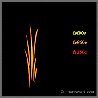


realistic fire drawn with photoshop elements, step 33.  Using the color picker, make orange your foreground color. Rasterize the shape by holding CTRL and clicking the thumbnail in the layers palatte. Now go to Edit>Stroke (Outline) Selection. Make sure orange is the color in the dialogue box, and "Inside" is selected under Location. Choose an appropriate width. I'm using just 1 px here. Click OK.

If you can't see the orange or it's blocking out too much of the yellow, just undo the action (CTRL-Z), adjust the width, and do it again.

realistic fire drawn with photoshop elements, step 4
4.  Change the foreground color to red, then stroke it again. This time choose "Outside" for Location. I'm using 1 px again, but if you used a larger number for the orange, consider using a little less for the red. Click OK. Deselect the image (CTRL-D) then go to the layers palatte and make 2 copies of this layer.


One of these layers is simply a backup in case you decide to trash a layer and start over. Since we'll work only one at a time, only one needs to be visible.


realistic fire drawn with photoshop elements, step 5
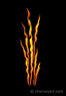
5.  With the visible layer, go to Filter>Distort>Liquify. Go over each of your lines with the Warp Tool (top of the tools on the left--looks like a hand finger-painting). Go over each or the lines a few times giving each a little bit of wiggle. I used a brush size of 20 (diameter should be a little more than the thickness of the lines) and brush pressure of 100. Click OK. It should look something like this:
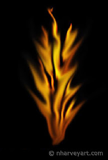


realistic fire drawn with photoshop elements, step 66.  Now take the smudge tool and start bluring the liquified lines, first going in short upwards strokes, then gently smudging them out to the sides. I'm using a soft-edged brush at 20 px and 10% strength. (I recommend making a copy of this layer first. It's very easy to use more smudge strokes than you can undo, and if you'd like to start over, you won't have to re-do the liquify step as well).


realistic fire drawn with photoshop elements, step 7
7.  Make that layer invisible, then repeat the Liquify and Smudge steps with another layer. Try to make the Liquify wiggles a little different. For the Smudging on this layer, I changed the brush to 30 px and the strength to 60%. This time you want to really spread out the pixels, creating more tongues of flame from the lines. Make sure these end in a point, perhaps giving them some curves.  (Again, you might want to make a copy of the layer between these steps.)


realistic fire drawn with photoshop elements
8.  After that, make both layers visible. You can play with opacities, layer order and blending modes to see what looks best for your purposes. Here I have the more smudged layer on top with the blending mode set to Screen. The less smudged layer has the opacity set to 65%. And then you're done.


Oh, and one more nifty tidbit I discovered: When you want to undo a long series of actions (like a series of smudge strokes), you don't have to do CTRL-Z for every one. Just hold down CTRL and hit Z repeatedly as fast as you like. Nice little time (and irritation) saver.

Now get out that list of drawing ideas and set something on fire!


Thanks for visiting and please come again!