Notice

Notice: The links of products and designs for sale on this site contain cookies in the form of a referral code. The purpose of this is simply to allow me to receive credit for any purchase you may make as a result of having visited my blog first. This does NOT provide me with any information about you or impact the price you pay for any merchandise, but it will increase my commission. If you object to this, simply do not click on any such links. (Links to contest entries and art not stated to be for sale do not contain cookies.) Thank you for your support and understanding.

Friday, December 12, 2014

Another Giveaway & Woot Entry

Double duty on the blog post once again. First, I've got a $10 gift code to Zazzle up for grabs, good on any purchase of $10 or more. It is valid through December 14, 2014, 11:59 PM, Pacific Time.

Here's all the fine print:

$10.00 discount applies to Zazzle orders with a subtotal (before shipping and taxes) of $10.00 or more when the coupon code is applied at checkout. Offer is valid until 12/14/2014 at 11:59pm PT. This offer does not apply to past purchases and may not be combined with any other Zazzle promotional or volume discount offers. This promotional offer may not be used on Zazzle gift certificates. Offer valid on Zazzle.com only.

First person to email me at nharveyart@gmail.com (you can click the request box to the right) gets it! I'll be checking my email as often as I can, but I won't be able to monitor it constantly, so it might take me an hour or two to respond if you're the first. I'll update this post once it's been awarded. Good luck!

And on to part two...

The folks at Woot are already craning their necks in search of Cupid and this weekend's derby is to design a "Sweet and/or Sour Valentine." I came up with something I'm calling "The Ultimate Symbol of Love." 


I know what you're thinking..."Eww, the germs!" Well, there's germs in kissing too, isn't there? And if someone gives you a sweet chewed into the shape of a heart, you've got to assume that's on their mind. Or perhaps you'd prefer the idea of it without the actual germs. In that case, please vote for my submission.

Thanks for visiting and please come again!

-------------------------

Update: Though I had plenty of visits to this site, no one who came felt the desire to spend $10 at Zazzle and the code as now expired unclaimed. Perhaps the next time I offer one I'll be rewarded with making someone happy.


Sunday, December 7, 2014

How to Make a Hoodie Pillow

It's a busy time of year for me, one when I put my energy into making the holidays enjoyable for family and friends, so I haven't been doing a great deal art-wise. Instead of a new artwork, this post will fall into the category of "other creative endeavors" as I share a little life-hack I've come up with. I'm not entirely sure it's original, but I did come up with this on my own and have not seen it elsewhere.

I'm not a morning person and loathe dragging myself out of bed at the required hour, often in darkness. Having to trade a warm bed for shivers can make this an excruciating task. Having the clothes I'll change into already warm is a small consolation I can enjoy, and here's how I manage it.

1.  I start the night before with a hooded, half-zip fleece which I usually wear in the morning anyway. Any pullover with a hood should suffice. Spread it out like this:


2.  Next I fold my clothing for the next day into a neat pile that will fit onto the chest area of the fleece. Here I'm using a sweater and a pair of jeans. Socks and underwear would go between these.


3.  Now, bring the arms across the center: 


4.  Next fold the lower half up over the clothes:


5.  Finally, bring the hood down over the center square and tuck the bottom corners into it:


The result is a fleece wrapped pillow. Take it to bed with you... snuggle it, place it beneath your knees or whatever feels comfortable, but keep it beneath the covers and close to you.

When you get up in the morning, your clothing will be as warm as your bed! If you aren't getting dressed immediately, be sure to pull the covers back over them until you do, but don't wait too long because it will all cool down without your body heat to warm it.

Here's another set of pictures using a hooded sweatshirt:


Thanks for visiting and please come again!


Friday, November 14, 2014

A Dragon Hide Journal


The Woot Derby has been changing things up lately. For starters, they're now running TWO derbies per week. The main derby, for shirts, now begins on Monday which now regularly gives artists additional time to work on their submissions after the Thursday theme announcement.

Another change is that the 2nd derby (the one they'll run first after the theme announcement) will be for another product, and for some of these products, many of the restrictions regarding colors, halftones, gradients and photographs have been thrown out the window. For that I'm all "YAY!" because I love artistically editing photos.

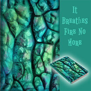
This week the product is journals and I'm excited to be entering an edited photograph which I've altered to look like iridescent dragon hide. Here's a view of the full front (right side) and back of the design.

It Breathes Fire No More, artistically edited photo, dragon hide skin iridescent

The title is "It Breathes Fire No More," since, obviously, if his skin is binding a book, he's no longer in need of a breath mint. But as this is merely Photoshop work, no actual dragons were harmed in its creation.

I started with a photograph I'd done some editing on before and had used to create a patten with different colors. (I'm not going to show the original here now, as I'd like to keep the Wooters guessing as to what it might be, but by sometime on Monday when this derby ends, I'll update this post to display the original.)

This time, I first improved the overall lighting by making several copies and adjusting the levels (ctrl-L) to optimize each section, regardless of how bad it made the remainder of the image. I then masked each, and worked on the masks to reveal only the best portion of each layer, combining them into a single image to finish.

Working with a desaturated version, I added layers of color, mostly with a wet media brush and at low opacity, then changed the blending modes of these layers to "color" and "overlay." And voila! Dragon hide.

http://shirt.woot.com/derby/entry/81893/it-breathes-fire-no-more

"It Breathes Fire No More" will be up for voting now through Monday, November 17, 2014, noon Central Time. Winners will be revealed and available for purchase on Monday, November 24th.  I hope you'll click over there to offer your support and check out what I'm sure will be a very interesting selection of art this week!

Thanks for visiting, and please come again!

--------------------

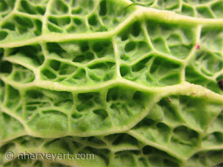
And here's the original, a close-up shot of a Savoy Cabbage. I saw this and loved the texture, but in working the photo, I ended up inverting so that deeps and highs were reversed. Nature provides such beauty.

Savoy cabbage leaf close-up


Wednesday, November 12, 2014

Giveaway--Today Only!

Who would like a coupon code for $10 to spend at Zazzle?

I have one for $10 off a minimum $20 purchase, but it's VALID TODAY ONLY (November 12, 2014), and I will give it to the first reader who emails me at nharveyart@gmail.com (you can click the request box to the right).

Here's the fine print:

$10.00 discount applies to Zazzle orders with a subtotal (before shipping and taxes) of $20.00 or more and the coupon code **********  is applied at checkout. Offer is valid until November 12, 2014 at 11:59pm PT. This offer does not apply to past purchases and may not be combined with any other Zazzle promotional or volume discount offers. This promotional offer may not be used on Zazzle gift certificates. Offer valid on Zazzle.com only.

I'll be checking my email as often as I can, but I won't be able to monitor it constantly, so it might take me an hour or two to respond if you're the first. I'll update this post once it's been awarded. Good luck!

Thanks for visiting and please come again!

-----------------------------

Update:

The $10 code has been claimed. Congratulations to Chris! Enjoy shopping at Zazzle!

I get these offers every now and then, and I can't always use them myself. I'll be sure to offer them here again in the future when that happens.

-----------------------------


Friday, October 24, 2014

Christmas, Bigfoot and Cookies

Everyone knows a Bigfoot fan. They range from those who are continually amused at the idea of such a novel creature to those who make forays into the wild to bang sticks and whoop out calls in hopes of a response. (I often wonder whether any responses are real or possibly another Bigfoot searcher.) Many fall in between, spending their weeknights glued to reality programs searching for elusive cryptids. I've got one of those.

It is in their honor that I created my newest design, "Christmas with Bigfoot."  He's overcome his shyness and is out for a walk, ready to spread some holiday cheer!

Christmas with Bigfoot sasquatch art

I uploaded the design in various parts so that I could arrange the elements (Bigfoot, trees, snow) most appropriately for each product. It was a bit more work than usual, but I'm quite happy with the way they turned out, with each differently shaped Zazzle products getting the best possible design arrangement.


Oh yes, I did mention cookies, didn't I? That's why you're still reading. I haven't forgotten and no, Bigfoot did not run off with them. This post is a "two-fer," or rather, a "three-fer."

I've been fascinated with repeating patterns and how they work so well for products like wrapping paper. Using a photomontage technique, I baked a batch of my favorite Christmas cookies—rolled out, cut into shapes and sprinkled with colored sugars—then photographed them. In Photoshop, I then cut the cookies from their background and piled them into a repeating pattern, one with an assortment of shapes and colors, and another with only tree shapes. Here are "Christmas Sugar Cookies" and "Sugar Cookie Christmas Trees."


Don't they look appetizing? (I can testify that they were delicious and exploding with crunchy-vanilla-sweetness!) Here are just a couple of the Zazzle products on which they're available.


Thanks for visiting, and please come again!


Friday, October 10, 2014

Tetris, Pointillism and the Eiffel Tower

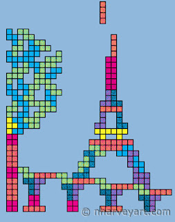
"Not Playing to Win" -- Eiffel Tower Tetris art using pointillism

Sometimes my mind works in strange, roundabout ways.

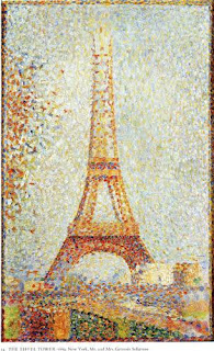
Take the latest Woot Derby challenge, to create a design in one of four artistic styles, one of which was pointillism. Pointillism is a technique where a picture is formed from a multitude of colored dots. Under magnification, all you would see is dots. Stand back, and they seem to magically herd themselves into a wondrous image of subtle colors.

An outgrowth of Impressionism, one of the pioneers in this technique was Georges Seurat. For inspiration, I looked at his paintings, and was drawn to this one of the Eiffel Tower.

The Eiffel Tower by Georges Seurat

I thought about how I could use the technique and emulate this picture, but put a different spin on it. Square dots instead of round ones? Somehow that led to blocks, then Tetris blocks which could be used to build a structure and THEN... make the Tetris blocks out of dots. Yes, that would be interesting.

I didn't want to merely throw the Tetris shapes together like a puzzle; I wanted to be sure that if they were constructed in the course of a game, that the arrangement was viable. I started by making the shapes and constructing a tower by copying, pasting, arranging and rearranging. At first I thought I'd have just the tower and perhaps a pile of discarded pieces off to the side. But that didn't satisfy me, so I looked again at Seurat's painting and played around with adding the bridge and the tree to the side. The constant copy, paste and transform actions got old very quickly, especially considering that each paste created a new layer and it was difficult to keep track of which was which. So I printed out page full of blocks, cut them out, and played with them at the kitchen table for a while. Once I had a bridge and basic tree, I returned to pasting it together in Photoshop.

Arranging paper Tetris pieces 2Arranging paper Tetris pieces 1


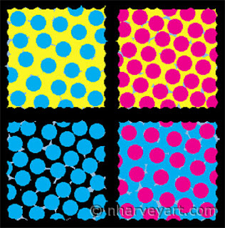
The next step was to "trace" the design using only dots. I did use the "snap to guides" feature to keep the outlines of all the blocks straight and orderly. And since I was using only cyan, magenta, yellow, black and white, I played around with combinations of dots in varying densities to get the color shades I wanted. Here are some close-ups, the second showing green, orange, purple and dark blue (clockwise from upper right).

Close-up 2, "Not Playing to Win" -- Eiffel Tower Tetris art using pointillismClose-up 1, "Not Playing to Win" -- Eiffel Tower Tetris art using pointillism

I’ve titled it “Not Playing to Win” since creating such a configuration in Tetris (if one were fortunate enough to get the right pieces and know where to place them) would quickly lead to the loss of the game. Still, I imagine it would be worth it and that reflects my attitude about the designs I create for the derby.

Submission for "Not Playing to Win" -- Eiffel Tower Tetris art using pointillism

This design will be up for voting on the Woot Derby now through October 16, 2014 at noon Central Time. If you've ever purchased anything at all from Woot.com, you are eligible to vote. Thank you for your support and be sure to check out all the wonderful designs... I'm sure there will be some excellent artwork on display this week.

Thanks for visiting and please come again!

Friday, October 3, 2014

Autumn Kaleidoscope


Often when we describe something colorful, we call it a kaleidoscope. Remember those things? Put a tube to your eye like you would an old-fashioned telescope and gaze at chips of colored glass reflecting into a mesmerizing pattern. Turn the barrel, and it would change, folding from one design into another.

Autumn is a colorful time as the green of the trees first dulls, then transforms into bursts of orange, red and yellow. For people like me who dread the fading of warm weather, the warm colors are a comfort and encouragement that I can make it through another round of cold weather.

The theme for this week's Woot Derby is Fall and Oktoberfest. They suggested making pies for them (and perhaps that would have curried some favor), but shipping one and keeping it fresh would have been problematic. Instead I was inspired by the kaleidoscope and created a design as I imagined one would appear if it were filled with jewel-like leaves.To make sure my representations were accurate, I searched for leaf models from various trees--maple, oak, birch, hickory and locust. I sketched each of these including some acorns as well, painted on the colors and arranged them over a 1/6 segment of a circle (there's your pie, Woot). I trimmed away anything that extended beyond the pie slice, then copied and turned it to fill the other slices, reversing every other one. And voila—a kaleidoscope of autumn color.

I actually began this design for Woot's Fall themed derby last year, but was unable to finish it in time. Another reminder that seasons change, and if fall comes again, so will spring and summer.

Autumn Kaleidoscope Woot submission -- digital art colorful fall leaves relfected

This entry will be up for voting now through next Thursday, October 9, 2014 at noon Central Time. I'm grateful for your support!

Thanks for visiting and please come again!

Monday, September 15, 2014

You're Spending Christmas with Who? Yes.

It sounds like a line from an Abbott and Costello sketch (and yes, I know it should be "whom"), but for Whovians everywhere, it makes perfect sense. The annual Christmas special has become a traditional way to wrap up the holiday. A glass of eggnog and the BBC are a delightful pairing.

So are we liking the new guy? After four weeks I, for one, am quite happy with Peter Capaldi's version of the iconic character. The new Doctor is a delightful curmudgeon with a streak of eccentric social oblivion, yet remains true to his core values. His attire is both understated and snappy, and the new TARDIS interior has the flavor of traditional elegance with a streamlined, modern flair.

Happily, none since Six have attempted to repair the chameleon circuit, and we still have the classic blue police box exterior we've all grown to love. It's an image that inspires dreams of adventure and a better world, and one that many of us enjoy looking at in our daily lives.

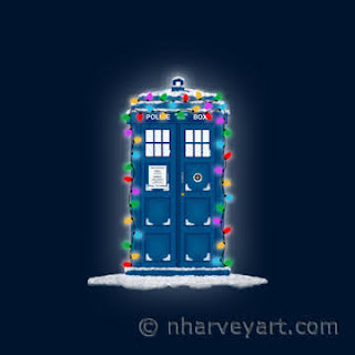
With that in mind, I'm happy to announce (as promised a few weeks ago) a new Christmas police box design in two variations... with and without snowfall.

Police Box with Christmas Lights & Snow Police Box with Christmas Lights

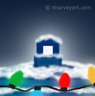
In making this design, I placed each of the bulb colors on different layers then added a glow around them using Layer Styles. It would not have been possible to make the glow the same colors as the lights had they been on the same layer. It's a subtle embellishment, but one I think contributes to the overall impression of warmth. I also added more glow around the top light and the whole than I did on earlier versions.

Police Box with Christmas Lights Close-up 1; layer styles glow Police Box with Christmas Lights Close-up 2; layer styles glow

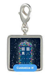
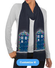
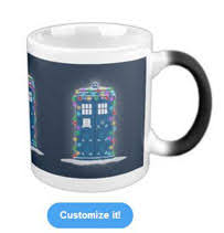
"Police Box with Christmas Lights" and "Police Box with Christmas Lights & Snow" are available on wrapping paper, greeting cards and a great variety of other Zazzle products including MORPHING MUGS!...because what's better than a police box that appears and disappears as your beverage changes temperature?

Police Box with Christmas Lights & Snow Wrapping Paper Police Box with Christmas Lights & Snow Charm Police Box with Christmas Lights & Snow Candy Tin
Police Box with Christmas Lights Scarf Police Box with Christmas Lights T-shirt Police Box with Christmas Lights Morphing Mug

Several other versions sporting a holiday wreath  and a non-holiday version are also available. Delight the Whovian on your gift list or bring home a little blue box cheer for yourself.

Thanks for visiting and please come again!


Wednesday, August 27, 2014

Jupiter All Over

Threadless submission for Jupiter All Over

Ever have an idea you think is relatively simple and can be knocked out quickly, only to find that once you've begun, it's much more complicated than you ever imagined? That's exactly what I experienced this week.

I dare say that aside from our lovely Earth home, Jupiter is the most beautiful in our solar system. Named for the Roman king of the gods, it certainly is the largest, and astrologers refer to it as the Greater Benefic," some condering it a significator of good luck or at least of expansion. I'd been admiring a photo of it when I thought it would make a lovely print for a shirt. All it needed was a little editing... enhance the color, maybe try some filters to see how they looked.

Er...not quite. The project, at least, surely expanded.

Since I wanted to be sure to include that identifying feature of the Great Red Spot to one side of the shirt, I had to search for an image that matched that placement. Those were fewer than I'd hoped. But after finding this and verifying that it was in the public domain, I downloaded this one:


I started with some basic color adjustment, mostly increasing the overall saturation. It helped me to see more of what needed to be done with the rest of the image.Part of the image was in shadow, and I needed as much colorful canvas area as I could get. Playing with the light adjustments was not enough. So I duplicated the image and adjusted the shadowy part to be as bright as I could without making it look unreal. I then put a mask on it, and a gradient within the mask to hide all the parts that were too bright. I then combined these layers and trimmed the ragged edge. The shadow wasn't gone, but was significantly less.

Jupiter image before editing shadow Jupiter image after editing shadow

After this I enlarged the image to be more suitable for printing via a method called step interpolation. I increased the size and pixel density by small amounts repeatedly until it got to where I wanted it to be. Normally this does not work well on a photograph, often resulting in fuzziness and distortions, but I often use it in my artistic edits where the images are more forgiving.

At this point I noticed the image appearing as if it was composed of many squares. I hadn't had this happen before, so I magnified the original and saw that they were there as well. I was unable to find out for certain, but I'm guessing that the originals were a composite of many pictures taken by the space probe, with minute differences in angle and time accounting for the difference in lighting in each. (Please leave a comment if you can confirm this or some other reason for the image's appearance.)

Closeup of pixilation in Jupiter imageBut as the final result of this was intended to have a more artsy appearance anyway, there was something I could do about it. I zoomed in on the squares and started blending them together with the smudge tool, one by one. I figured these were all pictures of clouds swirling together, so running the colors together a little more would not detract from the final impression. If anything, I think it made it look better, much like layers of paint dabbed and smeared together in a stormy cosmic marbling. Once this was done (and my hand uncramping), I decided any further transformations through filters would be overkill.

In the final phase, I tried a mockup and decided the color needed more work. This time I focused on the reds and yellows to brighten the oranges. The lower portion of the image was also in a bit of shadow, so after applying enhancements to the whole image, I used the selection tool to work only on the lower third, and then smaller sections as needed to bump up the color impact in these. I also increased the sharpness by a small amount and lastly, distorted the image slightly by increasing the width. This was necessary to be sure there was more than enough to cover the entire canvas of the shirt, but not enough to be recognizably stretched out.

Threadless submission for Jupiter All Over

Could this be your lucky shirt? Score it on Threadless and give it a chance! In addition, Threadless is trying something new with this particular competition. Not only can you score the entries, you can also opt to "fund" them. This essentially means filling out a pre-order form to buy the shirt IF it prints. If at least 50 people fund a design, it will print. If it doesn't print, you pay nothing.

And here's some luck for you already, as appreciation for visiting my blog...I'm giving you a coupon code to get $5 off, good for this design only. It's:  KJXEXW

Scoring is going on now through the evening of September 2, 2014 (Eastern Time). And if $5 is not enough, you can earn a rebate by signing up for Ebates and going to Threadless by clicking through their site or downloading their extension (as well as for purchases on many other shopping sites). Thank you for your support!

Thanks for visiting, and please come again!
Friday, August 15, 2014

Return of the Time-Traveling Police Box!


"Dostoyevsky Knew Him?" quote with police box design

I admit it. I'm a Whovian. At least I know I'm not alone.

Next week marks the return of "Doctor Who," starring Peter Capaldi as the twelfth incarnation of The Doctor. I'm anxious to see what he will be like. But while we all have our first doctor and our favorite doctors, for me, it's all about that magical blue box... the TARDIS. Vworp...vworp...vworp...

I can't explain the fascination. It's magical, science-y, retro, steam-punk, low-key and fantastical all at the same time. She also seems to have her own personality. One of my favorite episodes is "The Doctor's Wife," where her soul is downloaded into a woman and she converses with the "thief" whom she actually stole. Absolutely delicious!

I've developed a bit of an obsession with police boxes in general, since the very idea of one brings to mind the joy, fear and intensity experienced by the companions in the series. And especially since they no longer exist for practical purposes, the novelty lends them a beauty not noticed when they were common. I'll even get excited when I see a British phone box that's not a blue police box, like these on the grounds of Kentuck Knob, a Frank Lloyd Wright designed home I once toured:


I enjoy drawing them, and have several versions available on Zazzle products, in the Christmas and Fun Stuff Categories (with a new version coming soon!).

But today, I'm sharing a completely new design AND the announcement that nharveyart is now on Redbubble! I've titled this one, "Dostoyevsky Knew Him?" (available with either black or white text on a variety of t-shirt colors and on other products).

"Dostoyevsky Knew Him?" quote with police box design

I came across this quote from Fyodor Dostoyevsky's Crime and Punishment:

"Pain and suffering are always inevitable for a large intelligence and a deep heart. The really great men must, I think, have great sadness on earth."

How could I not think of The Doctor after reading that? He's incredibly clever and is all heart (even though he has only two), yet carries the pain of great loss. I imagine a story where he visits 19th century Russia, and in the course of making sacrifices to defeat alien ruffianism, meets the author, thereby planting the seeds that later surface in the novel. Daydreaming is fun. (I'd love read such a fanfic; if someone decides to take that idea and run with it, leave a comment with a link to the result!)

Of course, one could also look at this design and think of the clever and selfless police officer that served his municipality, forsaking time with his family to keep the citizens safe. There is a hero deep within us all, and that blue box has become a symbol of that. In drawing the box, I abandoned straight, rectangular shapes and instead gave it a leaning, hunched look to show those moments when conscience and personal conviction can lead to circumstances that weigh heavily on one's spirit.

I'm slowly stocking my Rebubble store with many of the designs already available at Zazzle. Redbubble offers some unique Print On Demand products, including duvet covers (a great canvas for my Abstract Collection) and Tote Bags on which the design covers the entire bag.

Blue-Violet Swarm Duvet Cover, abstract design with blue, purple, magenta, lavender, veined, dimpled, roundedChrysanthemums Within The Lines, artistically edited photo, like pencil drawing, with warm colors of pink, orange, yellow mums


Thanks for visiting and please come again!