Notice

Notice: The links of products and designs for sale on this site contain cookies in the form of a referral code. The purpose of this is simply to allow me to receive credit for any purchase you may make as a result of having visited my blog first. This does NOT provide me with any information about you or impact the price you pay for any merchandise, but it will increase my commission. If you object to this, simply do not click on any such links. (Links to contest entries and art not stated to be for sale do not contain cookies.) Thank you for your support and understanding.

Wednesday, August 27, 2014

Jupiter All Over

Threadless submission for Jupiter All Over

Ever have an idea you think is relatively simple and can be knocked out quickly, only to find that once you've begun, it's much more complicated than you ever imagined? That's exactly what I experienced this week.

I dare say that aside from our lovely Earth home, Jupiter is the most beautiful in our solar system. Named for the Roman king of the gods, it certainly is the largest, and astrologers refer to it as the Greater Benefic," some condering it a significator of good luck or at least of expansion. I'd been admiring a photo of it when I thought it would make a lovely print for a shirt. All it needed was a little editing... enhance the color, maybe try some filters to see how they looked.

Er...not quite. The project, at least, surely expanded.

Since I wanted to be sure to include that identifying feature of the Great Red Spot to one side of the shirt, I had to search for an image that matched that placement. Those were fewer than I'd hoped. But after finding this and verifying that it was in the public domain, I downloaded this one:


I started with some basic color adjustment, mostly increasing the overall saturation. It helped me to see more of what needed to be done with the rest of the image.Part of the image was in shadow, and I needed as much colorful canvas area as I could get. Playing with the light adjustments was not enough. So I duplicated the image and adjusted the shadowy part to be as bright as I could without making it look unreal. I then put a mask on it, and a gradient within the mask to hide all the parts that were too bright. I then combined these layers and trimmed the ragged edge. The shadow wasn't gone, but was significantly less.

Jupiter image before editing shadow Jupiter image after editing shadow

After this I enlarged the image to be more suitable for printing via a method called step interpolation. I increased the size and pixel density by small amounts repeatedly until it got to where I wanted it to be. Normally this does not work well on a photograph, often resulting in fuzziness and distortions, but I often use it in my artistic edits where the images are more forgiving.

At this point I noticed the image appearing as if it was composed of many squares. I hadn't had this happen before, so I magnified the original and saw that they were there as well. I was unable to find out for certain, but I'm guessing that the originals were a composite of many pictures taken by the space probe, with minute differences in angle and time accounting for the difference in lighting in each. (Please leave a comment if you can confirm this or some other reason for the image's appearance.)

Closeup of pixilation in Jupiter imageBut as the final result of this was intended to have a more artsy appearance anyway, there was something I could do about it. I zoomed in on the squares and started blending them together with the smudge tool, one by one. I figured these were all pictures of clouds swirling together, so running the colors together a little more would not detract from the final impression. If anything, I think it made it look better, much like layers of paint dabbed and smeared together in a stormy cosmic marbling. Once this was done (and my hand uncramping), I decided any further transformations through filters would be overkill.

In the final phase, I tried a mockup and decided the color needed more work. This time I focused on the reds and yellows to brighten the oranges. The lower portion of the image was also in a bit of shadow, so after applying enhancements to the whole image, I used the selection tool to work only on the lower third, and then smaller sections as needed to bump up the color impact in these. I also increased the sharpness by a small amount and lastly, distorted the image slightly by increasing the width. This was necessary to be sure there was more than enough to cover the entire canvas of the shirt, but not enough to be recognizably stretched out.

Threadless submission for Jupiter All Over

Could this be your lucky shirt? Score it on Threadless and give it a chance! In addition, Threadless is trying something new with this particular competition. Not only can you score the entries, you can also opt to "fund" them. This essentially means filling out a pre-order form to buy the shirt IF it prints. If at least 50 people fund a design, it will print. If it doesn't print, you pay nothing.

And here's some luck for you already, as appreciation for visiting my blog...I'm giving you a coupon code to get $5 off, good for this design only. It's:  KJXEXW

Scoring is going on now through the evening of September 2, 2014 (Eastern Time). And if $5 is not enough, you can earn a rebate by signing up for Ebates and going to Threadless by clicking through their site or downloading their extension (as well as for purchases on many other shopping sites). Thank you for your support!

Thanks for visiting, and please come again!

Friday, August 15, 2014

Return of the Time-Traveling Police Box!


"Dostoyevsky Knew Him?" quote with police box design

I admit it. I'm a Whovian. At least I know I'm not alone.

Next week marks the return of "Doctor Who," starring Peter Capaldi as the twelfth incarnation of The Doctor. I'm anxious to see what he will be like. But while we all have our first doctor and our favorite doctors, for me, it's all about that magical blue box... the TARDIS. Vworp...vworp...vworp...

I can't explain the fascination. It's magical, science-y, retro, steam-punk, low-key and fantastical all at the same time. She also seems to have her own personality. One of my favorite episodes is "The Doctor's Wife," where her soul is downloaded into a woman and she converses with the "thief" whom she actually stole. Absolutely delicious!

I've developed a bit of an obsession with police boxes in general, since the very idea of one brings to mind the joy, fear and intensity experienced by the companions in the series. And especially since they no longer exist for practical purposes, the novelty lends them a beauty not noticed when they were common. I'll even get excited when I see a British phone box that's not a blue police box, like these on the grounds of Kentuck Knob, a Frank Lloyd Wright designed home I once toured:


I enjoy drawing them, and have several versions available on Zazzle products, in the Christmas and Fun Stuff Categories (with a new version coming soon!).

But today, I'm sharing a completely new design AND the announcement that nharveyart is now on Redbubble! I've titled this one, "Dostoyevsky Knew Him?" (available with either black or white text on a variety of t-shirt colors and on other products).

"Dostoyevsky Knew Him?" quote with police box design

I came across this quote from Fyodor Dostoyevsky's Crime and Punishment:

"Pain and suffering are always inevitable for a large intelligence and a deep heart. The really great men must, I think, have great sadness on earth."

How could I not think of The Doctor after reading that? He's incredibly clever and is all heart (even though he has only two), yet carries the pain of great loss. I imagine a story where he visits 19th century Russia, and in the course of making sacrifices to defeat alien ruffianism, meets the author, thereby planting the seeds that later surface in the novel. Daydreaming is fun. (I'd love read such a fanfic; if someone decides to take that idea and run with it, leave a comment with a link to the result!)

Of course, one could also look at this design and think of the clever and selfless police officer that served his municipality, forsaking time with his family to keep the citizens safe. There is a hero deep within us all, and that blue box has become a symbol of that. In drawing the box, I abandoned straight, rectangular shapes and instead gave it a leaning, hunched look to show those moments when conscience and personal conviction can lead to circumstances that weigh heavily on one's spirit.

I'm slowly stocking my Rebubble store with many of the designs already available at Zazzle. Redbubble offers some unique Print On Demand products, including duvet covers (a great canvas for my Abstract Collection) and Tote Bags on which the design covers the entire bag.

Blue-Violet Swarm Duvet Cover, abstract design with blue, purple, magenta, lavender, veined, dimpled, roundedChrysanthemums Within The Lines, artistically edited photo, like pencil drawing, with warm colors of pink, orange, yellow mums


Thanks for visiting and please come again!


Friday, August 8, 2014

When You're Not A Football Fan

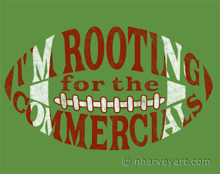
"Go Sponsors!" football word art

I honestly was going to stay away from the Woot Derby this week. Christmas! I've got to focus on Christmas designs! I looked at the derby theme, saw "Football," and sighed with relief. I know barely anything about football. Good, I won't get distracted.

Much later, while engaged in some menial chore, the thought again crossed my mind that I know nothing about football and how the closest I've come to engaging in it is checking out the more popular Super Bowl commercials.

Oh no.

There was my idea, and I just had to work on it. Stayed up until 2 am to get it done and off my mind.

"Go Sponsors!" football word art on model So what we have here is a shirt design I've titled "Go Sponsors!" which, from the distance, looks like a football. It's a form of word art where the words make up the graphic element of the design. Yes, wear this when you're dragged to the viewing party to spend the afternoon munching nachos before the big screen in total befuddlement. Maybe the others will be so focused on the game they won't notice what it really says."But they said there was only 5 minutes left to play!" Then someone presses a cold drink into your hand and says, "Good joke."
"Go Sponsors!" will be up for voting in the Woot Derby now through August 14, 2014, noon Central time. Anyone who's ever made a purchase from Woot.com is eligable to vote in the derby. Your support is greatly appreciated! And after all, football season begins well before Christmas.

"Go Sponsors!" football word art submission display

Thanks for visiting and please come again!

Saturday, August 2, 2014

Not A Creature Was Stirring


Well, maybe just one or two.

Have you noticed all the "Christmas in July" sales that just passed? Some stores even ran sales they called "Black Friday" sales. I'm definitely not a fan of what has become known as "Christmas creep," but it is the time to be thinking of the holidays for those of us who create Christmas designs. I have several ideas I'd like to get done, but will kick off with the design I used for my own holiday cards last year.

"Christmas Mice" artistically edited photo, painterly watercolor effect

As I've mentioned before on this blog, our family keeps pet mice (they're such sweeties!). I wanted to feature them on our Christmas card, so I sewed a little stocking for them then snapped picture after picture as they played around it. Mice are incredibly difficult to photograph because they move quickly and often. I think it was a Christmas miracle that I was able to get even one shot where both of them were still and posed with the stocking.

"Christmas Mice" original photo

 I also photographed some bunched up silky material to use as a background. I didn't want to put this down for the mice to play on thinking they might chew or soil it.

Fabric background

Using Photoshop, I cut out the picture of the mice and pasted it onto the fabric. I also cut out the shadows and pasted them on as well, but only used them as a guide to darken that section of the fabric image.

"Christmas Mice" composite before editing
 
Next, I started applying filters, including going over the entire image with the Impressionist Brush Tool. This tool is found in the toolbox after selecting the brush tool, and is symbolized by a brush surrounded by a swirl. This brush take the pixels that are already there and rearranges them into a pattern of paint strokes that give the picture an Impressionistic appearance. Once it's been selected, there are other parameters that may be set, first size, opacity and blending mode. Under the Advanced button are choices of stroke style, area (how much space around the brush is impacted) and tolerance (how similar in color pixels need to be before the brush will change them).

It's a good idea to record the settings you use so you duplicate a look that turns out to your liking...advice born from the regret of not doing so with this piece.

"Christmas Mice" is now available through Zazzle on greeting cards, address labels, wrapping paper and a number of other products. The inside of the cards read "Christmas... The perfect time to delight in the little things." (However, as all of these products are customizable, this may be removed or changed to anything you like.) Many thanks to our dear Squiggle and Griswalda!

"Christmas Mice" Greeting Card "Christmas Mice" Puzzle artistically edited photo, painterly watercolor effect
"Christmas Mice" address label artistically edited photo, painterly watercolor effect
"Christmas Mice" Wrapping Paper artistically edited photo, painterly watercolor effect

Thanks for visiting and please come again!